The Inverted News Formula
Johnny Harris has 7.8 million YouTube subscribers watching long-form explainer videos that routinely hit 20 to 40 minute runtimes. The format is instantly recognizable: black and white archival footage, animated maps, a host who walks through locations while narrating geopolitical history. But the real machinery is structural, not aesthetic. Harris has described his approach in three words: "visual evidence, then context." This inverts how TV news works. Traditional broadcast opens with a thesis, then shows supporting footage. Harris shows you the footage first, withholds the explanation, and uses that gap to pull you forward.
This is a retention architecture, not a journalism convention. The structure creates micro-mysteries every 30 to 90 seconds. A viewer sees a map animate, hears a provocative claim, watches archival footage of a crowd, and only then gets the payoff line that ties it together. The technique is now so codified that tutorial creators are building AI workflows specifically to replicate "Johnny Harris style documentaries", treating the format as a reproducible system.
The Anchor and Bridge Pattern
Fans call it the anchor and bridge structure. The anchor is a concrete visual: a specific photograph, a map zoom, a location shot. The bridge is the narrative thread that connects that anchor to the next one. Harris rarely lingers on abstract concepts for more than 10 seconds without cutting to something you can see. In the tutorial breakdown of his style, the analysis notes that during documentary segments, cuts slow to a medium pace of 2 to 4 seconds per shot, but only because each shot is densely packed with visual information. A map animates, a photo zooms, text overlays appear. The viewer is never watching a static frame.
The bridge is where Harris does the work. He uses first-person narration, often recorded on location, to create the feeling of discovery. The script structure is consistently: observation, question, partial answer, complication, fuller answer. This is not a lecture. It is a guided tour where the guide is figuring things out alongside you. The effect is that a 25 minute video on Iranian geopolitics or the history of borders feels like it moves faster than a 90 second TikTok explainer, because the viewer is always chasing the next anchor.
Motion Graphics as Narrative Propulsion
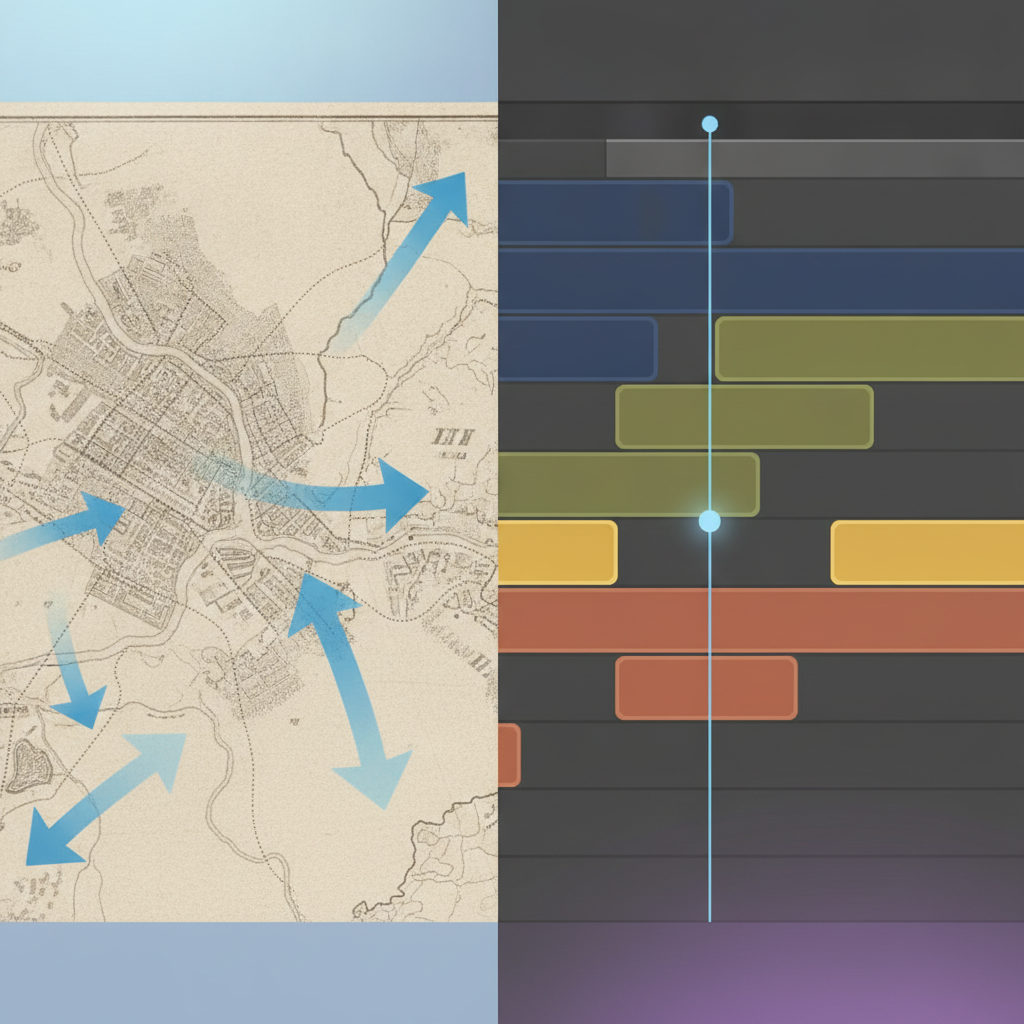
Harris uses motion graphics the way other creators use jump cuts. Every map, every timeline, every stat is animated. A country border does not appear, it draws itself in. A date does not display, it counts up or slides into frame. The tutorial analyzing his technique highlights "extensive use of animated graphics, including connecting lines, expanding boxes, and animated text overlays" as core to the style. These are not decorative. They are pacing tools. The animations give the editor permission to hold a shot for 3 or 4 seconds because something is still moving on screen.
This is expensive. Motion graphics at this density require either a dedicated animator or significant post-production time. But the trade-off is retention. A static map with a voiceover explaining troop movements will lose viewers in 8 seconds. An animated map where arrows draw themselves in, icons pop up, and labels fade in as the narration hits each beat holds attention for 30 seconds or more. The motion graphics are doing double duty: they are illustrating the point and they are creating the sensation of forward momentum.
Harris also uses a specific color and typography system. The tutorial notes that his documentary footage is often black and white, contrasting with vibrant blue and green accents in motion graphics. The consistency makes the format recognizable within 3 seconds of autoplay. A business trying to replicate this does not need Harris's exact fonts, but it does need a locked visual system that repeats across every video.
The Three-Act Structure Inside Every Segment
Harris videos are long, but they are not monolithic. Each segment inside the video follows a compressed three-act structure: setup, complication, resolution. A 30 minute video might contain 6 to 8 of these mini-arcs. The setup is always visual. You see a location, a photograph, a map. The complication is a question or a contradiction. The resolution is the explanation, but it is usually incomplete, which tees up the next segment.
This is why his videos work as background content but also reward active viewing. A viewer who tunes in halfway through can pick up the thread within 60 seconds because the current segment will re-establish context. A viewer who watches start to finish gets a compounding payoff because each segment builds on the last. The structure is modular but cumulative.
The tutorial creator analyzing his format breaks the workflow into six steps: learning the style, picking the story, planning the "brain" (narrative structure), generating images, animating shots, and editing. The planning phase is the leverage point. Harris is not improvising in the edit. The script and shot list are locked before production. The editing is assembly, not discovery. This is how he maintains the format's consistency across dozens of videos per year.
What EditorDuel Readers Can Take From This
The Harris structure is not limited to geopolitics or documentaries. The core mechanic (visual evidence, then context) works for product explainers, case studies, founder stories, and educational content. If you are producing long-form content and struggling with retention past the 2 minute mark, the anchor and bridge pattern is the diagnostic tool. Are you showing something concrete every 30 seconds, or are you asking the viewer to hold an abstract concept in their head while you talk?
The motion graphics investment is real, but it scales. A business producing 4 videos per month can build a template library of animated maps, timelines, and stat overlays that get reused with updated data. The first video is expensive. The tenth video is fast. The key is committing to a visual system and not deviating. Harris's audience expects the black and white footage, the animated maps, the on-location narration. That expectation is an asset. It means a viewer knows within 5 seconds whether this video is for them.
The modular segment structure also solves a production problem: you can shoot and edit segments out of order. If one segment is waiting on archival footage or a location shoot, you can finish three others and drop it in later. This is how small teams produce long-form content at velocity. You are not editing a 30 minute video. You are editing six 5 minute videos that happen to live in the same file.
Want to build content like this for your business? Post a competition on EditorDuel and get matched with editors who can deliver.