Casey Neistat did not invent the jump cut or the handheld vlog. But he turned both into a signature visual language that YouTube subscribers can recognize in under three seconds. His editing vocabulary is not about expensive gear or color science. It is about rhythm, momentum, and the refusal to let a single frame bore the viewer.
For businesses hiring editors, the Neistat playbook offers a rare case study: how technical craft, when applied with relentless consistency, becomes brand identity. His videos do not look polished in the traditional sense. They look like Neistat. That distinction is worth understanding.
The Cut Rhythm: Fast Enough to Sustain Attention, Slow Enough to Land Meaning
Neistat's cut rhythm operates in two gears. In his marathon explainer short, the opening talking head shots hold for 3 to 5 seconds each. When he starts drawing the marathon route on the map, cuts accelerate to 1 to 2 seconds, especially when B-roll of runners integrates with his narration. The rhythm speeds up during the explanation of why the course is difficult, then slows slightly for the summary.
This is not random. The longer cuts establish context and credibility. The faster cuts deliver payoff and momentum. In his New York favorites video, shots change every 1 to 2 seconds during high energy explanations, maintaining pace without sacrificing comprehension. Shot lengths vary between 1 and 5 seconds across his work, but the variance is what matters. He never locks into a metronome. He edits to the energy of the moment.
One analysis notes that if you watch five minutes of a Neistat vlog, two things are immediately true: the cuts are fast, and the man does not stop moving. The editing mirrors the subject. This is not accidental. It is the entire design.
Time Lapses as Structural Anchors, Not Filler
Neistat opens most vlogs with a time lapse. This pattern is so consistent that viewers expect it. The time lapse is not B-roll. It is a narrative device that compresses time, establishes location, and signals the start of a story. It also solves a retention problem: cold opens with talking heads lose viewers in the first five seconds. Time lapses give the eye something to track while the brain catches up.
The abrupt endings work the same way in reverse. Neistat often ends vlogs mid sentence or mid action, leaving viewers wanting more. This is not laziness. It is deliberate incompletion. The video does not resolve. It stops. The psychological effect is subtle but measurable: unfinished narratives create a compulsion to return.
The Map, The Marker, The Physical Prop as Visual Anchor
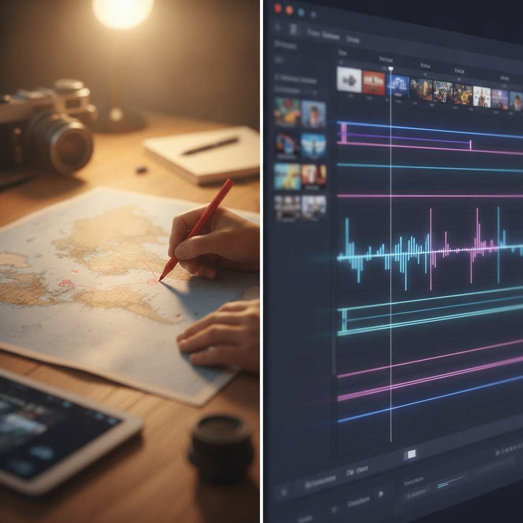
In the marathon short, Neistat draws the route on a large map with a red marker, placing pushpins as he narrates. The map is not a graphic. It is a physical object in the frame. He touches it, marks it, points at it. This tactile interaction gives the viewer a concrete anchor. The brain processes physical objects faster than motion graphics.
In the New York favorites video, the same map reappears. He places pins, draws routes, uses the map as both a visual aid and a storytelling device. The overhead shots of the map, combined with his narration, create a layered information delivery system: verbal, visual, spatial. This is not complex. It is just intentional.
The red marker itself becomes a recurring visual element. It is not branded. It is just red. But repetition turns it into a signature. OutlierKit notes that the channel's success is tethered to Neistat's highly distinct personal brand, unique editing style, and decades of built up audience trust. The marker is part of that vocabulary.
Sound Design: Clean Dialogue, Minimal Music, Ambient Authenticity
Neistat does not bury his videos in royalty free electronic music. In the marathon short, there is no background music at all. The audio is clean dialogue and nothing else. This keeps focus on the explanation. In the New York favorites video, sound effects punctuate moments (a thump when he places a pin, a whoosh during transitions), but the primary audio layer is his voice.
In the marathon vlog short, the audio is entirely natural: his voice, ambient crowd noise, no score. This creates authenticity. It also reduces production time. No music licensing, no mix sessions, no EQ tweaking beyond dialogue clarity. The editorial choice is also an operational choice.
One analysis describes Neistat's editing style as concise and intuitive, built on short impactful cuts, rapid transitions, and creative storytelling. The sound design supports that structure. It does not compete with it.
The Selfie Frame: Direct Address as Retention Anchor
In the marathon vlog, the video opens with a selfie style shot: Neistat and a companion looking directly at the camera, speaking to the viewer. The shot holds for 10 seconds, then cuts to runners, then returns to the selfie frame for the final 25 seconds. The selfie is not just a camera angle. It is a narrative bookend.
Direct address creates parasocial immediacy. The viewer is not watching a produced segment. They are being spoken to. The video structure is hook (selfie, stating the goal), action (B-roll of runners, screen recording of tracking app), payoff (return to selfie, confirm the goal was met). The selfie frame is the through line.
This is vlog grammar. It is not innovative in 2026. But Neistat helped codify it in 2015, and his approach is still studied in editing courses that cite his beginning, middle, end structure as a retention framework.
What EditorDuel Readers Can Take From This
Neistat's editing vocabulary is not about plugins or presets. It is about decisions. Fast cuts when energy peaks, slower cuts when context matters. Time lapses as structural anchors, not filler. Physical props (maps, markers) as visual anchors. Clean sound design that prioritizes dialogue. Selfie frames that create direct address. Abrupt endings that leave viewers wanting more.
These are not expensive techniques. They are intentional techniques. One source notes that Neistat's strategy is less about short term payouts and more about long term control. The same applies to his editing. He is not chasing trends. He is reinforcing a visual identity that compounds over 12.7 million subscribers and hundreds of videos.
For businesses, the lesson is not to copy the Neistat aesthetic. It is to understand that editing craft, when applied consistently, becomes recognizable. Viewers do not need to see a logo to know whose video they are watching. The cuts tell them.
Want to build content like this for your business? Post a competition on EditorDuel and get matched with editors who can deliver.