Cleo Abram has built a YouTube channel by making astrophysics, AI, and deep sea biology feel urgent and accessible. Her videos explain topics that would flatten most audiences in seconds. The work succeeds because of a specific set of editorial choices: dynamic cut rhythm that shifts with content density, a consistent visual metaphor vocabulary, and a narrative structure that moves from broad question to granular payoff.
This is not about Abram's on-camera presence or her optimism about technology. This is about the mechanical decisions that make complex material retain attention.
The Two-Speed Cut Rhythm
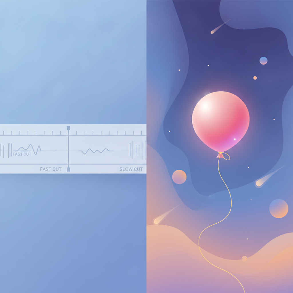
In her recent video on finding alien life, the cut rhythm operates on two distinct tempos. During interview segments and direct-to-camera explanations, cuts land every 1 to 3 seconds, a medium pace that allows verbal concepts to settle. The moment the video shifts to B-roll, illustrating planets, telescopes, or the Drake Equation, the rhythm accelerates to under 1 second per cut.
This is not arbitrary. The fast cuts during visual sequences prevent dead air while complex ideas load. A viewer watching animated planets or spectral signatures does not need 3 seconds per shot. They need rapid visual confirmation that the concept has multiple dimensions, then a return to the slower verbal pace where the creator explains what they just saw. The rhythm creates a metabolic loop: fast visual intake, slower cognitive processing, repeat.
The interview segments use jump cuts between Abram and her expert guest, but these cuts respect speech cadence. They land between clauses, not mid-sentence. The result is conversational flow without the lag of unedited pauses.
Visual Metaphor as Structural Scaffold
Abram's videos rely on recurring visual metaphors that compress abstract scientific concepts into physical objects. In the alien video, she uses a large pink balloon to represent a star, with smaller objects and hands representing orbiting planets. This is not a one-off illustration. The balloon returns multiple times across the video's runtime, each time reinforcing the same spatial relationship: star in the center, planets in motion around it.
The metaphor does two things. First, it gives the viewer a mental anchor. When Abram shifts back to animated space graphics or spectral data, the audience has already internalized the core geometry. Second, it creates visual continuity. The balloon becomes a recurring character in the narrative, a familiar object that signals "we are still talking about the same system."
Text overlays reinforce this. Key terms like "Transit Spectroscopy," "Doppler Method," and "Starshade" appear on screen in bold type the moment they are spoken. Numerical data, like "10,000,000,000x FAINTER," gets its own full-screen treatment. The overlays are not decorative. They function as cognitive bookmarks, giving the viewer a second encoding path for information that might otherwise evaporate in the verbal stream.
The Question-Setup-Payoff Structure
Every Abram video opens with a direct question to the audience. The alien video begins with "And when we say intelligent, what do we actually mean?" This is immediately followed by a jump cut to an expert looking thoughtful. The structure signals: this is not a lecture, this is an inquiry, and you are about to hear from someone who has spent years on the answer.
After the hook, the video enters a setup phase where Abram introduces the broader topic (finding alien life) and the methods scientists use (transit spectroscopy, Doppler shifts, starshades). The setup is paced with medium cuts and frequent returns to Abram's direct address. Then the payoff: detailed explanations of each method, supported by fast-cut B-roll, motion graphics, and the visual metaphors established earlier.
Energy peaks are engineered into the payoff sections. The B-roll sequences use upbeat, energetic music and sound effects (the "pop" of a deflating balloon, the "whoosh" of a rocket launch) to create emotional punctuation. These peaks prevent the middle of the video from sagging. A detailed explainer on spectral signatures could easily lose momentum partway through. The sound design and cut rhythm spikes keep the viewer's arousal level elevated.
Color and Motion Graphics as Information Density Tools
The color grading in Abram's videos is bright and saturated, especially in the animated sequences. Planets glow in vivid blues and oranges. Space backgrounds are deep blacks with high-contrast star fields. This is not Instagram aesthetics. High saturation increases information density per frame. A viewer can parse a colorful, high-contrast image faster than a muted, low-contrast one.
Motion graphics are used not as decoration but as explanatory tools. In the alien video, the Drake Equation is displayed as an animated formula where each variable lights up as Abram explains it. The transit method is shown as a graph with a dipping line, synced to Abram's verbal description of a planet passing in front of a star. These graphics do not repeat what is being said. They provide a parallel visual proof.
The result is that a viewer can follow the explanation through two simultaneous channels: verbal and visual. If one channel drops out (the viewer looks away, or mishears a term), the other channel is still delivering the core information.
What EditorDuel Readers Can Take From This
Abram's format is expensive to replicate at full scale (motion graphics, expert interviews, location shoots), but the structural principles are portable. Any business producing educational or explanatory content can apply the two-speed cut rhythm: slow down for verbal complexity, speed up for visual confirmation. This works for SaaS explainers, product demos, and founder storytelling.
The visual metaphor system is even more accessible. If you are explaining a technical process, find a physical object or spatial relationship that mirrors the logic. Use it early, use it often, and make it visually distinct. Text overlays for key terms cost nothing and double retention for viewers who process information visually.
The question-setup-payoff structure is a direct replacement for the typical "intro, body, conclusion" format that kills retention in the first 30 seconds. Start with a question the viewer already has, or one they did not know they had until you asked it. Then prove you can answer it.
Finally, sound design and music are not post-production polish. They are structural tools that control energy levels across the video's runtime. If your content has a natural dip (the technical middle section, the pricing explanation, the methodology breakdown), that is where you need a sound design spike or a cut rhythm acceleration.
Building Content Like This For Your Business
Abram's videos work because every editorial choice serves retention and comprehension. The cut rhythm, the visual metaphors, the text overlays, the sound design, all of it is engineered to keep a viewer engaged with material that would otherwise demand a textbook.
If you are producing content that needs to educate, explain, or persuade, these are not optional techniques. They are the difference between a video that gets watched and one that gets abandoned at the 90-second mark.
Want to build content like this for your business? Post a competition on EditorDuel and get matched with editors who can deliver.